
Now live
The dashboard is live — explore it with your own data.
Everything shown on this page is running today. Sign in to see your own kitchens, periods and reports.
dashboard.eaternity.ch
Product tour
A carbon number you can act on
Most food sustainability tools report one figure for your whole operation. It is defensible in a slide and useless in a kitchen, because nothing a chef or a buyer does will ever move it.
This dashboard is built the other way round. Every figure opens — from the group total down to a single tomato, and back again. Here is how that works, in the order the questions usually come up.
Start here
Before the number means anything, you need to know what is in it
A footprint calculated from 60% of your purchase data is not a footprint. It is a guess with a decimal point — and it will always look flattering, because the missing invoices are emissions nobody counted.
That is why the controls come first rather than last. Coverage, the sites included, the period, and whether you are counting what was produced or what was sold — all of it is stated before a single chart appears.
These are the product's own controls — open them.
Completeness sits in front of every figure, alongside the scope, period and calculation basis it was measured on. Open the selectors — the same scope carries through every view below.
137.0 kg
Total Carbon dioxide emissions for period
−56%
Performing better than benchmark
1.7 kg
2.2 kg below average per meal
A
Rating based on Carbon dioxide emissions
Each metric arrives with its rating. A number on its own invites the question “is that good?”; a number with an A–E grade and a peer comparison has already answered it.
Find the cause
Open the total until you reach something you can change
A group figure tells you the size of the problem. It never tells you what to do on Monday. Every number here decomposes — by level, by category, and all the way down to the purchase line that caused it.
The drill-down is what lets one dataset serve two audiences at once. A sustainability lead reports the group total; a chef opens the dish behind it and finds the tomatoes are Spanish and greenhouse-grown. Same figure, two useful readings.
The same figure, readable at every level
- IngredientTomato, ES, greenhouse0.4 kg
- RecipeTomato & basil soup1.2 kg
- DishSoup + sourdough1.7 kg
- Menu lineVegetarian line2.1 kg
- SiteZurich school312 kg
- GroupAll locations126 t
CO₂ impact breakdown by food category
- Meat & fish42%
- Dairy & eggs24%
- Plant-based18%
- Grains & staples11%
- Other5%
The same measurement at ingredient, recipe, dish, menu line, site, country and group level — and the category split that shows where the weight actually sits. In most kitchens a small part of the menu carries most of the emissions.
CO₂ emissions caused by all purchases, broken down into individual product categories
- Plant based products (246 t)149 t CO₂↗ 77.8%
- Grains (29.6 t)21.6 t CO₂↗ 84.7%
- Rice (9.38 t)14.9 t CO₂↗ 61.2%
- Plant based oil (10.1 t)27.9 t CO₂↗ 79.5%
- Legumes (11.5 t)7.02 t CO₂↗ 87.9%
- Vegetables (138 t)27.2 t CO₂↗ 78.2%
- Mushrooms (3.33 t)7.41 t CO₂↘ 141.8%
- Nuts and seeds (2.72 t)7.7 t CO₂↗ 74.0%
- Coffee beans (76.6 kg)732 kg CO₂↘ 48.7%
Purchases, with the emissions each caused and how they moved against last period. This is where sustainability stops being a target and becomes a specific line in a supplier order.
Beyond carbon
Menus are judged on more than their footprint
Cutting carbon is straightforward if it is the only thing you measure — serve less, serve worse. Nobody wants that outcome, which is why climate is one axis of several here.
Water use, nutritional quality, animal welfare and deforestation risk are all measured alongside CO₂, and the whole dashboard can be switched to any of them from the selector at the top. Each comes as a value and an A–E rating, comparable across dishes, sites and countries.
Actual consumption per category vs. the Planetary Health Diet reference bands.
Consumption per category against the EAT-Lancet Planetary Health Diet reference bands, resolved into one score. It answers a question a carbon figure cannot: is this food good for the people eating it?
Green bars show plant protein, red bars show animal protein, grey bars show the industry average. More plant protein = lower CO₂.
Protein source is the strongest single lever on a catering footprint, so it gets its own view — your plant-to-animal split per category, against the industry average.
Prove progress
A target is only real if you can watch it closing
Most commitments are discovered to have been missed at year end, when nothing can be done about them. Here the gap between where you are and where you said you would be is visible every month.
Tons of CO₂ emissions for selected period
Month-over-month CO₂ emissions over time
−28.4%
from previous month
Daily impact shows the shape of a service week; the monthly trend answers the question an executive team actually asks — is this going down, and by how much.
Monthly CO₂ per food unit vs the industry average (% better) over the selected period — with your target projection.
Up 0.6 ptsfrom May 2026 to Jul 2026
Your performance against the industry average, with the target projected forward. Actuals and ambition on one axis.
Anonymised comparison against industry peers
−56%
Performing better than benchmark
Your kitchens
Industry Average
Progress needs a reference point. Results are benchmarked anonymously against comparable operations, and against your own prior period — usually the fairer of the two, because it compares like with like.
Download monthly reports for each kitchen.
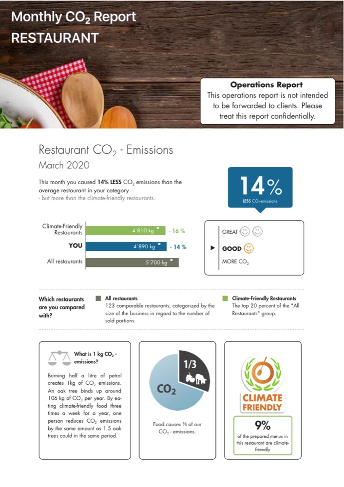
The Monthly CO₂ Report
Benchmarks the site against climate-friendly and average peers, then breaks the month down by product choice and meal offering — and ends with the certificates a kitchen can display for its guests.
And because most of the people who need these numbers will never log in, every kitchen produces a monthly PDF in three versions — one for guests, one for the client, one for your own team. All from the same data, so the poster in the canteen and the client’s quarterly review cannot contradict each other.
Across the estate
Four hundred kitchens, one dataset
Everything above has to hold when there are hundreds of sites in a dozen countries, each with its own chefs, clients and reporting obligations.
Managing members across your organisation. Active team: Example Group
- Example Group
- North Region; R01
- City Hospital; S104
- Riverside Campus; S212
- Central Office; S018
- Airport Terminal 2; S330
- Lakeside School; S077
Namespace: example-group
Access groups mirror your real structure — country, region, client, site — and permissions inherit down that tree. A site chef sees their kitchen, a regional manager their region, a group lead the whole estate. One dataset, sliced by accountability.
See it with your own dishes
The version of this walkthrough worth having uses your recipes, not our sample data. Send us a handful of dishes and we will show you where the numbers land — including where they agree with what you already have, and where they do not.
The dashboard components on this page are illustrations of the Eaternity Gastro interface. Figures shown are representative sample data, not a customer’s results.